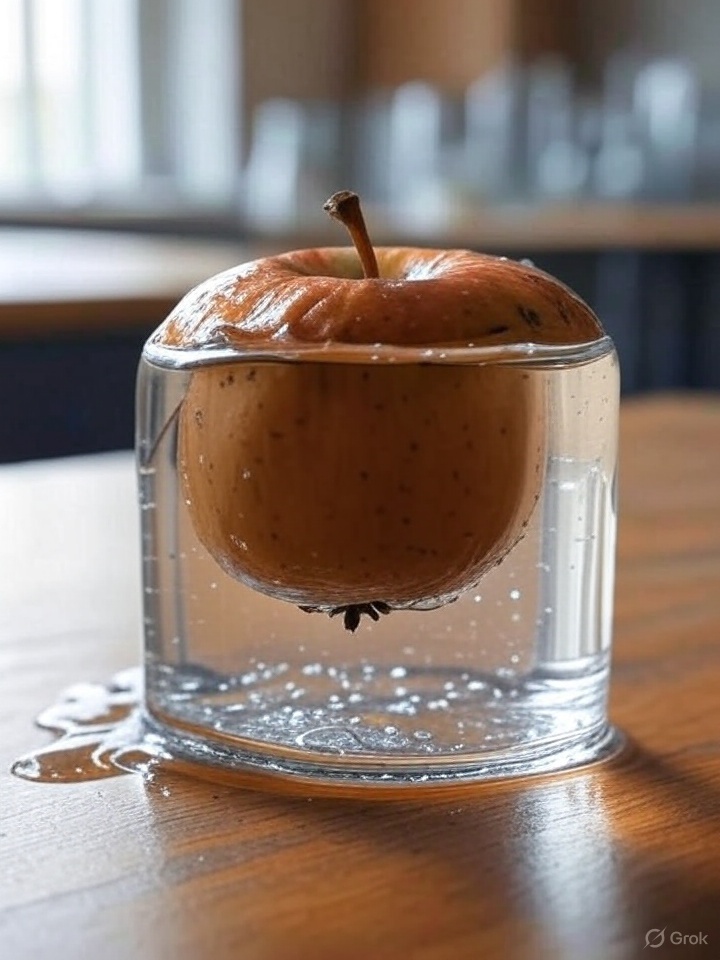
WWDC25 has just kicked off and lots of news started to circulate. The most shiny and selling feature is a new look for entire ecosystem called Liquid Glass. So I decided to jumped on a hype train and take look for myself.

Bugs
Popup keyboard is stale
Keyboard is not responsive btw and looks like just a stale picture but when I type I still get my input. It’s just I don’t get a normal UX feedback with buttons visibly being pushed when pressed.

Passcode widget
When you press the close button inside the Passcode window keypad pops up for a fraction of a second but stacked under the passcode widget due to a layout bug.

Unproportional widgets
Menu items in the context menu look unproportionally big compare to the text input and the mic button in the Messages app.

Main panel looks glassy and tad blurry (why??)

Lock screen clock
Glassy but blur as well

Performance is still laggy
Just to switch between 2 tabs in an app (e.g. settings app) can take some significant amount of time, making your experience not that smooth and Zennish as you usually can expect from Apple.
Design is not consistent
See the Sign Out button look like an alien to the normal primary button in blue.

Apple’s design time machine

Not all apps support the latest Liquid Glass design. Some application feels a bit dated. Others – new but unpolished. Some – in between with hybrid design mix with classic and new design language. Looks super-inconsistent and unprofessional. Is Apple going to deprecate the old design in fall completely and what happens to all the worth of old (well not so old) apps?
Conclusion
Overall laggy and unpolished experience and need to put a lot of work to be complete. Design is still inconsistent and needs coordination between developers and designers with strong guidelines since seems developers understand and implement it their own way (means differently for different apps). So far I found only the Photos app more or less 60-70% conform to the claimed design but so many other apps also needed overhaul. And yes what about old apps and new apps but with old design. Will they still look like something alien? The number of issues and inconsistency is uncanny (and it’s only iPadOS I reviewed) and unlikely Apple is going to fix them it by this fall as they claim it.

